Agile architectures of the near future : The Picnic
Brief:
Working in groups we were asked to construct a timed based photograph documenting the
social ecology during our picnic at “Mount
Edgecumbe”. Looking at movements, light, sounds and how we experience our surroundings.
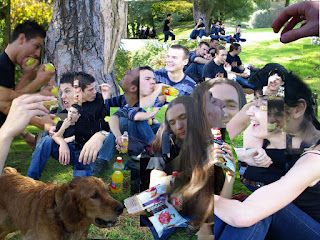
After a short ferry journey we set on our way o find the spot for our picnic. Our group found a real big tree with lots of dry grass and tree trunk leaning potential. Setting about our task we each took it in turns with the camera to capture the groups activities and here are some of those snap shots.
From these images I selected key sections which showed movement. I found the most movement from the head up. Using this as my main focus I cut an pasted the image together. You can see the movement within the image, on the left you see the rotational hand movement as the apple reaches the mouth and just to the right of that you can see the movement of the subjects head from the left to the right.
Then we were asked to notate our created image exploring not only the image but the space. Here are my findings:
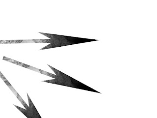
SOUND
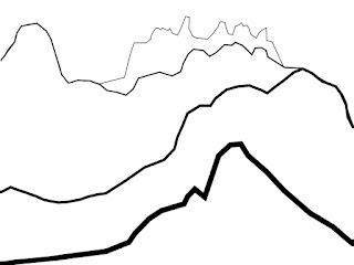
These images explore the sound
with the image. The first outlines the noise creating forms in the image reaching from the background to the foreground. The thicker the lines used the nearer and louder the sound is from my position, it also symbolises foreground space.
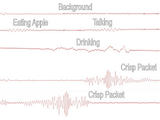
The second image was created using sound waves from recordings I made of objects found in areas of the image and
separately overlay ed onto the image. I then deleted the background and this is my result.
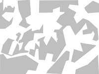
 MOVEMENT
In this image I outlined the movement of
different parts of my friends in the picnic image. The curve lines represent the lines of movement. The straight lines show the direct movement from one point to another, while the curved lines show rotated movement.
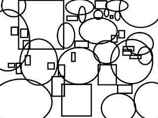
 HARD AND SOFT SHAPES
The squares represent the hard forms i.e. bottles, picnic table, crisps. The curved shapes represent soft forms i.e. clothing, grass.
 LIGHT AND SHADOW
This represents the movement of light and the creation of shadows. From this image you can tell the sun is shining from left therefore casting a shadow on the right hand side.
Putting them on my
original photo you can see where the abstract shapes came from. I have done image with each notation in a different colour to help define each one.
Here are another couple of images which came along with the ideas process.
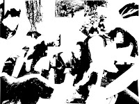
HARD OBJECTS
In the first image I have used the blur tool to show the softer sections within the image, this also enables the harder objects to seem visually sharper and therefore stand out more.
The second image works on colour blocking, the harder objects are given a solid block of black which removes there texture. This leaves the soft objects looking soft in both colour and texture.
DARK AREAS
In these images the idea is to look at contrasting tones. The first image uses just two tones, the hard edges aid my visual attempt to abstract from what was
originally there. the slight difference in the tone change was
purposeful, my aim was to recreate the natural differences in tones, in nature you would seldom see very strong visual colour abstractions. This
grayscale notation is at one with that idea.
This contrasts to the second image where there is a larger degree of tone difference. but this is
balanced out by
the fact i have left in detailed toning rather then completely blocking out the shapes.
Early Outcomes
Here are a couple of my outcomes.
The only problem I have with these layers of notation is the blocked elements from the hard and soft sections. i feel they don't work well with the rest of the notational layers. I think it would work better if I used the geometric shape approach because most of the image is line based so the layers would work at one together.
Looking at the images created I created a mould based on the chin structure. I chose this because talking and laughing was key in our picnic so the chin was one of the most prominent feature. I have taken photos of the cast in different angles so when I put the cast into the image it will fit over the chins of my subjects.
Here are my picnic images with the notation and moulds of chin added in place. The concentration of th casts show the more populated areas, this is from the middle horizontal of the image upwards. Inserting the cast helps give a real feel of timing in the image. In the centre right hand side you can see a good example of this, where there is a flow from left to right as the casts section rotates and moves. I can see a real flow developing, the casts seem to move from left to right in a wave, interesting the how social ecology can relate to natural movements found elsewhere.

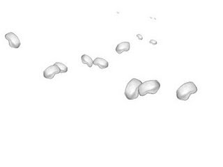
In this image I have taken away all the notation levels and have left the moulds in place. You can see strong clusters of cast forms which seem to dissolve into the backdrop. This gives the piece real depth withought even having the image behind. This is created by the lower casts being larger (making them seem closer) and then getting smaller (making them seem further away) as you move your eyes up the piece. I think thios is what makes the outcome visually effective.
Here are my A3 printouts of my notation levels. I have creased them based on the notational information. I have recreated a physical environment which is completely different to the start point but based on the same information. You can see the ridges i created by creesing the concentration based lines, giving an almost mountain range feel to the piece. I took a photo at a slight angle on the left image to show this in a more 3d perspective.


