Friday 12 December 2008

Idat 101 - Part 1 - Reinterpretation of Sound

Here is my video representing ambient sound we collected at the train station.


Here is an image displaying possible emotions of people around the station.


Here is a graph of information collected from the train times. It shows inbound journeys.

Thursday 11 December 2008

IDAT 101 - Part 1 - A Mindmap

This is my mind map for the work on the site. Helped me to organise work I need to do and also enables me to keep track of work I have done.

Wednesday 10 December 2008

Idat 106 The Field: human ecology

The Field: human ecology
In this section we were asked to look at different ways people move around the space. This was split into two sections GPS and Bluetooth.

GPS


"The Global Positioning System (GPS) is a satellite-based navigation system made
up of a network of 24 satellites placed into orbit by the U.S. Department of
Defense. GPS was originally intended for military applications, but in the
1980s, the government made the system available for civilian use."-http://www8.garmin.com/aboutGPS/
First I was asked to draw a path on a map of the university and follow our route using a GPS device. Using the buildings as rulers I drew my route;


"The signals travel by line of sight, meaning they will pass through clouds,
glass and plastic but will not go through most solid objects such as buildings
and mountains." - http://www8.garmin.com/aboutGPS/

So using the outer edge of the buildings in theory should work.


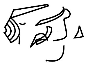
The idea of using GPS to create images is used by artist Jeremy Wood who created drawings on a map and set out to recreate them using a GPS. Here is an example of one he created in Brighton;


Here is an image of my path, each dot is a representation of a point of my journey. The image/shape I am trying to create is unclear due to the point positioning created by the GPS device. Which are accurate to 15m average so using on such a small space of the university campus can create inaccuracies.


Here I tried to make the shape clearer by drawing a line the path I took. Still looks like a distorted shape, but you can see the slight intentions of me trying to create a "G" shape.


Here is the path on a satellite image, I'm showing you this to give a an idea geographically where I walked and enable you to see the structures which make up the shape.

Here i have drawn a "G" to give you a more explicit idea of the shape i was trying to create. The "G" I have created represents the inner of the gps track i was trying to create.

Here is my narrative for the GPS project. On the right hand side you can see the movement through my GPS route, on the left you will see a changing photograph of my subject sitting in postion in my scene showing the route ahead. As the dot on the image stops the photo will change.


Bluetooth

In this section we were asked to form groups and choose a place to map out bluetooth devices. We decided to use the Roland Levinsky building as this was part of our university campus and we had access to it for a wide legnth of time. The different level sizes and secheduled lecture changes would also make interesting study. It also enabled us to see if the hour to hour running of the building affected the bluetooth traffic. Below is a floor diagram of each level we had access to:


Using our bluetooth enabled mobile phones we set out on each level and did a device search. Here are the levels of Roland Levinsky on two seperate days, with the names of the bluetooth devices I have found. I have also drawn tracks to where I have found the same devices on each level. This could be due to the strength of their bluetooth signal or them moving from floor to floor.


Day 1


Day 2


Below: Graph of the devices found. The two lines match a corrolation giving us a good idea of the bluetooth usage on all the floors. From ground floor to third floor there is the most bluetooth activity, we can see this form a large dome shape. Another interesting factor is from the first floor up the levels also get smaller in size, so as the level decreases in floor size the bluetooth activity also decreases.


Below: here are the connection lines of the level images. Taking them away from the background allows us to see the lines more clearly. This gives us an interesting visual map of space. You can also see the difference in strength of the bluetooth devices within the building, the longer the line the most levels the device was found on.


Here is my image created to show more clearly the concentration of bluetooth signals within the building. This could also relate to the population of each level (this information was based on data collected over 2 days). The higher density of monement the hotter the colour (Red), the lower density the colder the colour (Blue).


Heres my time based image. Time is shown horizontally, bluetooth activity levels are shown in colour. This image shows that there is a higher density of bluetooth activity every hour, this is probably due to the fact that there is an hourly changover of students for lectures therefore there are more students in the building on the hour then at any other time. More students the larger possibilty of bluetooth devices in that area.


Thursday 4 December 2008

Adding Myself To Paintings

We were asked to put our faces onto famous paintings... here are my attempts


Jean-Auguste-Dominique Ingres
The Sculptor Paul Lemoyne


Edvard Munch's
The Scream


Leonardo da Vinci
The Last Supper


Tuesday 25 November 2008

Bluetooth Mapping

We chose the Roland Levinsky Building For our subject of study.
Each level we used our phones to map the bluetooth usage.


Below: here are the leves of Roland Levinsky with the names of the bluetooth devices I have found. I have also drawn tracks to where i have found the same devices on each level. This could be due to the strength of their bluetooth signal or them moving from floor to floor.


Day 1


Day 2


Below: Graph of the scanned. You can see the relationship of where the bluetooth is mostly used. From ground to third floor there is the most bluetooth activity, we can see this from the large dome shape.corrolation of bluetooth between the floors on the 2 days in which we


Below: here are the connection lines of the level images. Taking them away from the background allows us to see the lines more clearly.


Here is my image created to show more clearly the concentration of bluetooth signals within the building. This could also relate to the population of each level (this information was based on data collected over 2 days)


Heres my time based image. Time is shown horizontally, bluetooth activity levels are shown in colour.


Wednesday 29 October 2008

Idat 101 Site Project - Part 1 - Beginning

Brief:
Working in pairs, we had to choose a site within a 2 mile radius of the University. On this site were are supposed to document everything we can using all resources, it could be the history of the ste, any storys, the people, how the site changes, noise levels etc...The site me and Christian chose was the train station. It connects many people from one place to another. The activity of the station all depends on different times during the day, what day it is and what time of year.


We started off by taking a few photographs.


Next I edited the photos in the form of image notation.


Making the images abstract. Using seperate coloured lines for the male and femails in the image give an idea of the male to femail corrolation. Also shows the distance, smaller lines further away the people are.


Blocked colour, geometric blocks fitting into the geometric forms of the man made structures.

This image displays the heat given off by the people at the station. Heat from orange for warm to blue for cold.

Abstracting image using geometric shapes for the people slightly blurred to enable the colours to merge better.

This is the result of me drawing a path of people through the car park to the station. I then removed the image to leave the movement lines.

Sunday 12 October 2008

Idat 106 Picnic - Social Interaction - movement project


Agile architectures of the near future : The Picnic

Brief:

Working in groups we were asked to construct a timed based photograph documenting the social ecology during our picnic at “Mount Edgecumbe”. Looking at movements, light, sounds and how we experience our surroundings.

After a short ferry journey we set on our way o find the spot for our picnic. Our group found a real big tree with lots of dry grass and tree trunk leaning potential. Setting about our task we each took it in turns with the camera to capture the groups activities and here are some of those snap shots.


From these images I selected key sections which showed movement. I found the most movement from the head up. Using this as my main focus I cut an pasted the image together. You can see the movement within the image, on the left you see the rotational hand movement as the apple reaches the mouth and just to the right of that you can see the movement of the subjects head from the left to the right.


Then we were asked to notate our created image exploring not only the image but the space. Here are my findings:


SOUND

These images explore the sound with the image. The first outlines the noise creating forms in the image reaching from the background to the foreground. The thicker the lines used the nearer and louder the sound is from my position, it also symbolises foreground space.
The second image was created using sound waves from recordings I made of objects found in areas of the image and separately overlay ed onto the image. I then deleted the background and this is my result.


MOVEMENT
In this image I outlined the movement of different parts of my friends in the picnic image. The curve lines represent the lines of movement. The straight lines show the direct movement from one point to another, while the curved lines show rotated movement.


HARD AND SOFT SHAPES
The squares represent the hard forms i.e. bottles, picnic table, crisps. The curved shapes represent soft forms i.e. clothing, grass.


LIGHT AND SHADOW
This represents the movement of light and the creation of shadows. From this image you can tell the sun is shining from left therefore casting a shadow on the right hand side.


Putting them on my original photo you can see where the abstract shapes came from. I have done image with each notation in a different colour to help define each one.


Here are another couple of images which came along with the ideas process.


HARD OBJECTS

In the first image I have used the blur tool to show the softer sections within the image, this also enables the harder objects to seem visually sharper and therefore stand out more.
The second image works on colour blocking, the harder objects are given a solid block of black which removes there texture. This leaves the soft objects looking soft in both colour and texture.


DARK AREAS

In these images the idea is to look at contrasting tones. The first image uses just two tones, the hard edges aid my visual attempt to abstract from what was originally there. the slight difference in the tone change was purposeful, my aim was to recreate the natural differences in tones, in nature you would seldom see very strong visual colour abstractions. This grayscale notation is at one with that idea.
This contrasts to the second image where there is a larger degree of tone difference. but this is balanced out by the fact i have left in detailed toning rather then completely blocking out the shapes.


Early Outcomes


Here are a couple of my outcomes.


The only problem I have with these layers of notation is the blocked elements from the hard and soft sections. i feel they don't work well with the rest of the notational layers. I think it would work better if I used the geometric shape approach because most of the image is line based so the layers would work at one together.


Final Moulds

Looking at the images created I created a mould based on the chin structure. I chose this because talking and laughing was key in our picnic so the chin was one of the most prominent feature. I have taken photos of the cast in different angles so when I put the cast into the image it will fit over the chins of my subjects.


Here are my picnic images with the notation and moulds of chin added in place. The concentration of th casts show the more populated areas, this is from the middle horizontal of the image upwards. Inserting the cast helps give a real feel of timing in the image. In the centre right hand side you can see a good example of this, where there is a flow from left to right as the casts section rotates and moves. I can see a real flow developing, the casts seem to move from left to right in a wave, interesting the how social ecology can relate to natural movements found elsewhere.


In this image I have taken away all the notation levels and have left the moulds in place. You can see strong clusters of cast forms which seem to dissolve into the backdrop. This gives the piece real depth withought even having the image behind. This is created by the lower casts being larger (making them seem closer) and then getting smaller (making them seem further away) as you move your eyes up the piece. I think thios is what makes the outcome visually effective.


Here are my A3 printouts of my notation levels. I have creased them based on the notational information. I have recreated a physical environment which is completely different to the start point but based on the same information. You can see the ridges i created by creesing the concentration based lines, giving an almost mountain range feel to the piece. I took a photo at a slight angle on the left image to show this in a more 3d perspective.


I then turned the piece over to see what the creasing had done on the reverse side. It is effective, the strong ridges stand out of the paper castinjg shadows over the flatter plains bellow.